This blog post is part of a series on engaging with your local community to build support for refugee resettlement. See our previous posts on Sharing Refugee Stories to Build Community Support and Using Data to Tell Program Stories…Without Putting Your Audience to Sleep.
Wondering whether your program data has potential for community engagement? Unsure of how statistics can capture an audience’s interest? A recent Switchboard blog post provided suggestions for using data to tell a story, and today we’re diving deeper into one interesting method: infographics.
What is an Infographic?
An infographic is one effective storytelling tool that combines information with visuals. Presenting your program results alongside colorful and dynamic illustrations can make data more accessible and interesting to your audience. Infographics can be used in any context and can include charts, illustrations, maps, and images. The design of an infographic depends on the most compelling way an intended message can be communicated using the information available.
One important advantage of infographics is that they’re sharable online. Multiple infographics may also be combined into fact sheets or one-pagers designed to communicate several key messages in one visual document.
How Can You Create One?
There are several approaches you can take when creating an infographic, but here are five simple steps to get started:
- Define a clear message for your infographic
- Determine what data will enable you to communicate that message
- Brainstorm how you’ll visualize the data for your infographic (How will you use charts? Icons? Maps? Text?)
- Lay out your infographic using an infographic template (Canva, Piktochart and Venngage have great templates)
- Add style to your infographic (typically, your colors and font choices should align with your organization’s brand)
Steps adapted from How to Make an Infographic in 5 Steps
Examples to Inspire You
Here are some real examples of infographics and fact sheets created by refugee service providers in the U.S. Click each image to expand it and see captions for sources and more details.
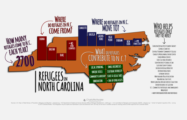
Charlotte Awake. See more examples.
Colorado Refugee Services Program. See more examples.
Seattle Office of Immigrant and Refugee Affairs. Read full fact sheet.
Champlain Valley Office of Economic Opportunity. Read full fact sheet.
Resources to Help
- How We Created and Released Infographics to Change Our State
Charlotte Awake & The Linking Communities Project, 2015
This guide shares the strategies used by Charlotte Awake to create infographics, including narrative-driven graphics that share stories about local refugee families and their contributions to the local community. You can also stream a recorded webinar on this topic and download the infographics. - Advancing Goals in Community Engagement: Editable Outreach Tools
Switchboard, 2019
This document contains three editable outreach templates, including a “Refugees in Your City” Fact Sheet template that may be adapted to advance your community engagement goals. This template includes information on the benefits that refugees bring to a city and statistics that can be personalized to your location to raise awareness in the community.


