This blog post is part of a series on engaging with your local community to build support for refugee resettlement. See our previous post on Sharing Refugee Stories to Build Community Support and stay tuned for a forthcoming post on How States and Other Refugee Service Providers are Using Infographics to Engage Communities.
Many of us don’t think about how we might communicate out our project data until the reporting stage, when we are required to look back on data and summarize it for a reader. Or conversely, given the vast extent of data many projects collect, we might be tempted to flood our communications materials with facts and figures.
A better approach is to think at the planning stage about what stories you hope to convey about your clients and how you can use project data as one tool in your toolbox for telling them. Here are a few ideas for using data purposefully as you work to tell clients’ stories.
Key Tips to Keep in Mind
There are a few pitfalls to avoid when setting out to use data to tell a story. The FrameWorks Institute, an organization dedicated to using social science research to study effective communications approaches, summarizes five in The Storytelling Power of Numbers:
- Unless numbers are married to a story, they are unlikely to mean anything to the public.
- Too often numbers are used to tell one story: Crisis.
- Social math unifies the narrative and the numbers. (Make numbers feel real by using familiar comparisons)
- Use numbers to tell causal stories. (Go beyond description)
- Uninterpreted numbers tell a story of random mayhem.
Many of these mistakes boil down to a single guiding principle: Data on its own is unlikely to tell a clear, compelling story. Without interpretation and contextualization, your audience will be lost. To see for yourself, consider these three variations on the same data:
A. No storytelling:

B. Storytelling for an internal or funder audience:

C. Storytelling for an external audience:

A Simple Step for Getting Started
Consider what you want the community to learn about your program and why—that is, what stories you want to be able to tell. Ideally, what you want the community to learn should guide the data you collect, so choose your questions carefully! Telling a story about your program’s outputs (e.g., how many trainings delivered or clients served) is important. However, telling a story about your program outcomes is often more compelling. This means asking not only “Did we do what we said we would?” but also “What changes have occurred in our clients’ lives?” Examples include:
- What need are we fulfilling?
- What services do we deliver? Who uses our services?
- To what extent are our services available or affordable?
- To what extent are our services delivered efficiently and according to best practice?
- What are the outcomes of our services?
From there, it’s a matter of identifying the data needed to answer those questions, then developing appropriate visualizations. Follow the tips in this Data Visualization Template for simple, straightforward data visualization using Microsoft Excel. Keep in mind that data visualizations created for different audiences—such as for your program team, for a funder, or for a local business leader—might vary substantially. And note that you don’t always need to create a chart. Sometimes a simple statement and icon are visualization enough:

Resources to Help
- Advancing Goals in Community Engagement: Editable Outreach Tools
Switchboard, 2019
This document contains three editable outreach templates, including a “Refugees in Your City” Fact Sheet template that may be adapted to advance your community engagement goals. This template includes information on the benefits that refugees bring to a city and statistics that can be personalized to your location to raise awareness in the community. - Data Visualization Template
The Monitoring and Evaluation Technical Assistance (META) Project, 2018
This document provides templates for some simple examples of data visualizations that communicate three common messages: how something changes over time, how one thing compares to another, and how a part relates to a whole. Instructions are included to help you create your own visualizations. - 5 Steps for Using Data to Tell Program Stories
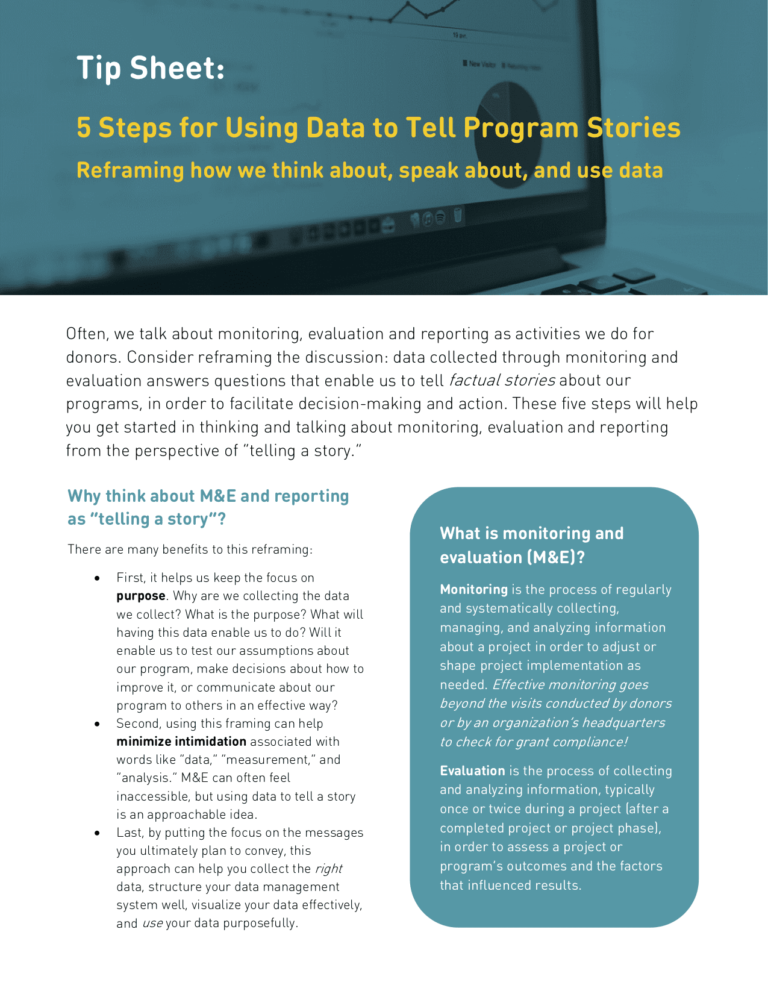
The Monitoring and Evaluation Technical Assistance (META) Project, 2017
This tip sheet walks through five steps you can take to reframe project data as a tool for telling factual stories about your program, in order to facilitate decision-making and action.